CHALLENGE 01
Clear Information Hierarchy
Present the certification proposition in a logical sequence so visitors can scan and understand the key information.

A focused website development project designed to present Partnr Certified clearly, communicate its value, and create a smoother experience for visitors across devices.
Website design and development focused on presenting the certification offering in a clear, accessible, and responsive format.
Partnr Certified needed a dedicated online experience for its certification offering. Our role was to develop the website page so visitors could understand the proposition, navigate the information, and take the next step with less friction.
The page brings the certification information into a focused web experience, with a structured content hierarchy and responsive layout.
A dedicated page should do more than look polished. It needs to organize information, establish trust, and help users find what matters quickly.
Present the certification proposition in a logical sequence so visitors can scan and understand the key information.
Keep the visual presentation aligned with the brand while using typography, spacing, and content blocks consistently.
Ensure the page adapts to desktop, tablet, and mobile screens without compromising readability or navigation.
Our website-development workflow focused on the content structure, page layout, responsive behavior, and final quality checks.
Review the page purpose, audience, and information that visitors need to find.
Organize content into clear sections with a natural reading and navigation flow.
Build the page layout with consistent styling and responsive components.
Check layout consistency, mobile behavior, readability, and key interactions.
The development approach prioritizes a clean structure and a usable interface instead of adding unnecessary visual complexity.
A closer look at the website experience we developed for Partnr Certified. Add your actual website screenshots below to showcase the page design, key content sections, and responsive mobile experience.
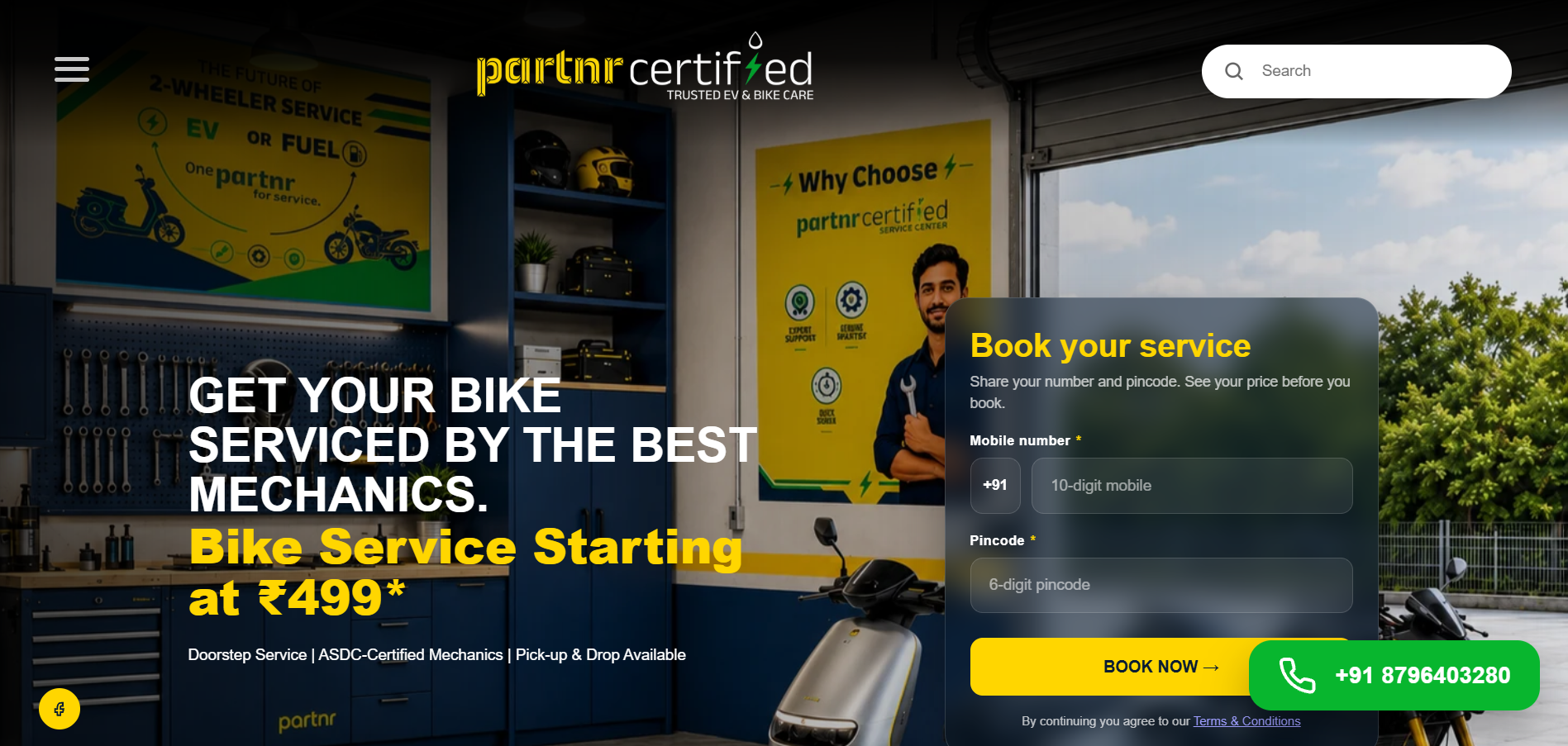
Use a full-width screenshot showing the main page layout and visual hierarchy.
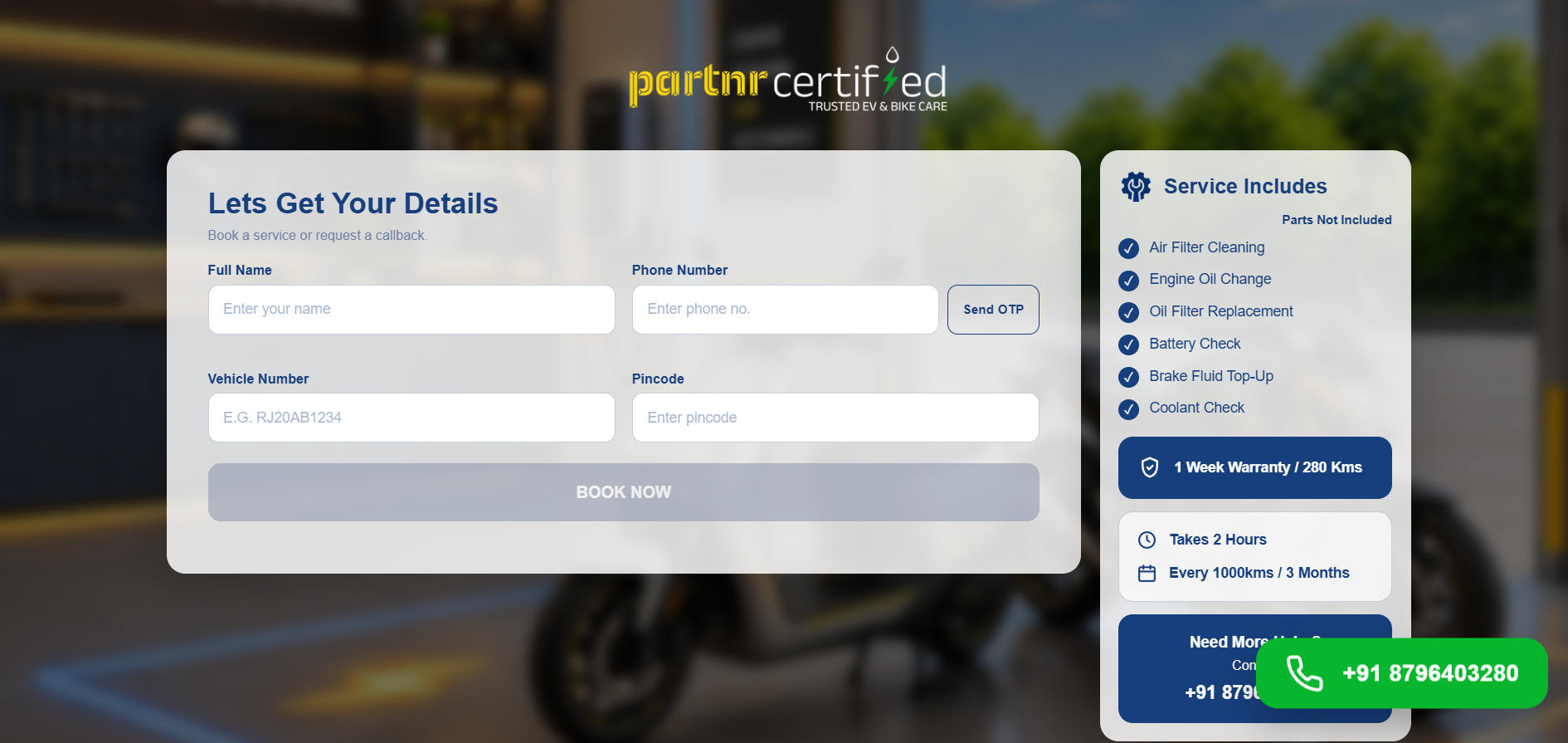
Highlight the certification details, content blocks, or primary call-to-action.
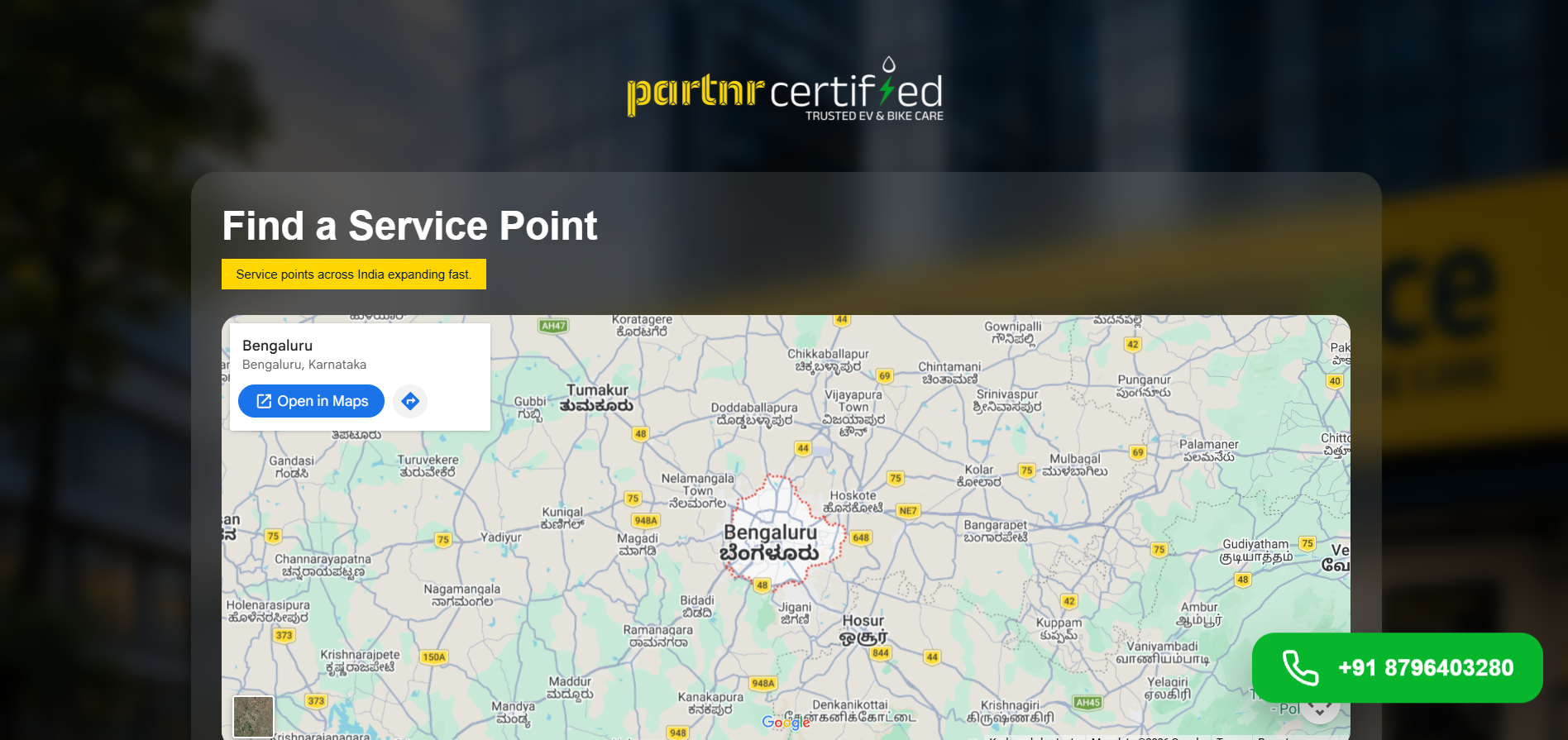
Help users easily locate nearby service points with a clear layout and accessible location information.
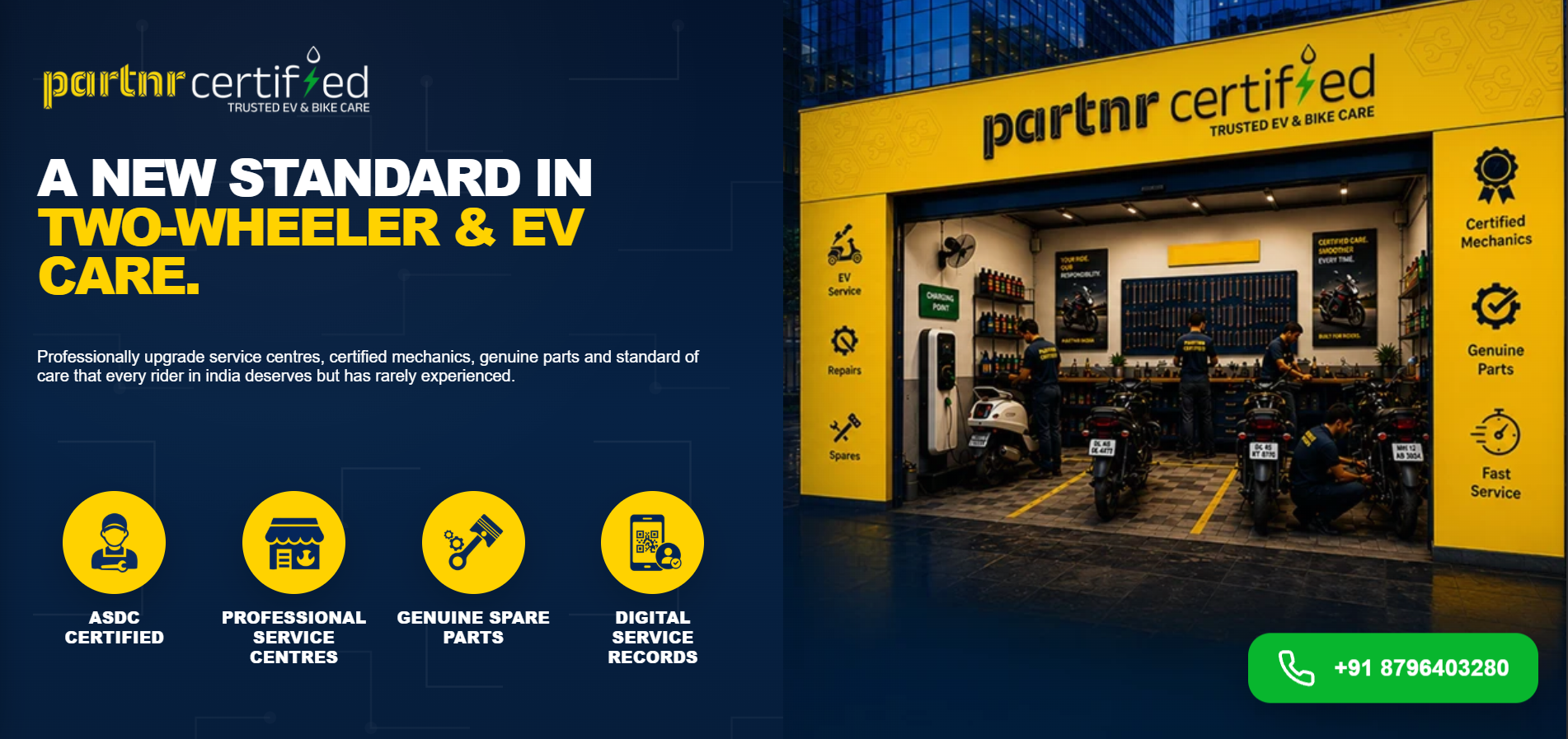
Use this slot for another section or full-page capture.
Our contribution for Partnr Certified was centered on website development.
Build a structured page layout that supports the content and user journey.
Adapt the layout and components for different screen sizes.
Apply consistent typography, spacing, colors, and reusable styling patterns.
Review the page for readability, layout behavior, and a coherent browsing experience.
The project delivered a focused web page for the certification offering, with information presented in a structured layout and a responsive experience designed for visitors across devices.
Explore Partnr Certified ↗From page development to responsive implementation, Growmoredigitally helps brands create clear, usable digital experiences.
Talk to Growmoredigitally ↗